MOCA is an independent global advertising and branding agency founded on clarity, emotion, and modern design sensibility. This identity project captures the agency’s dual nature, rational in structure, emotional in storytelling and resulting in a brand that radiates quiet confidence and timeless appeal.
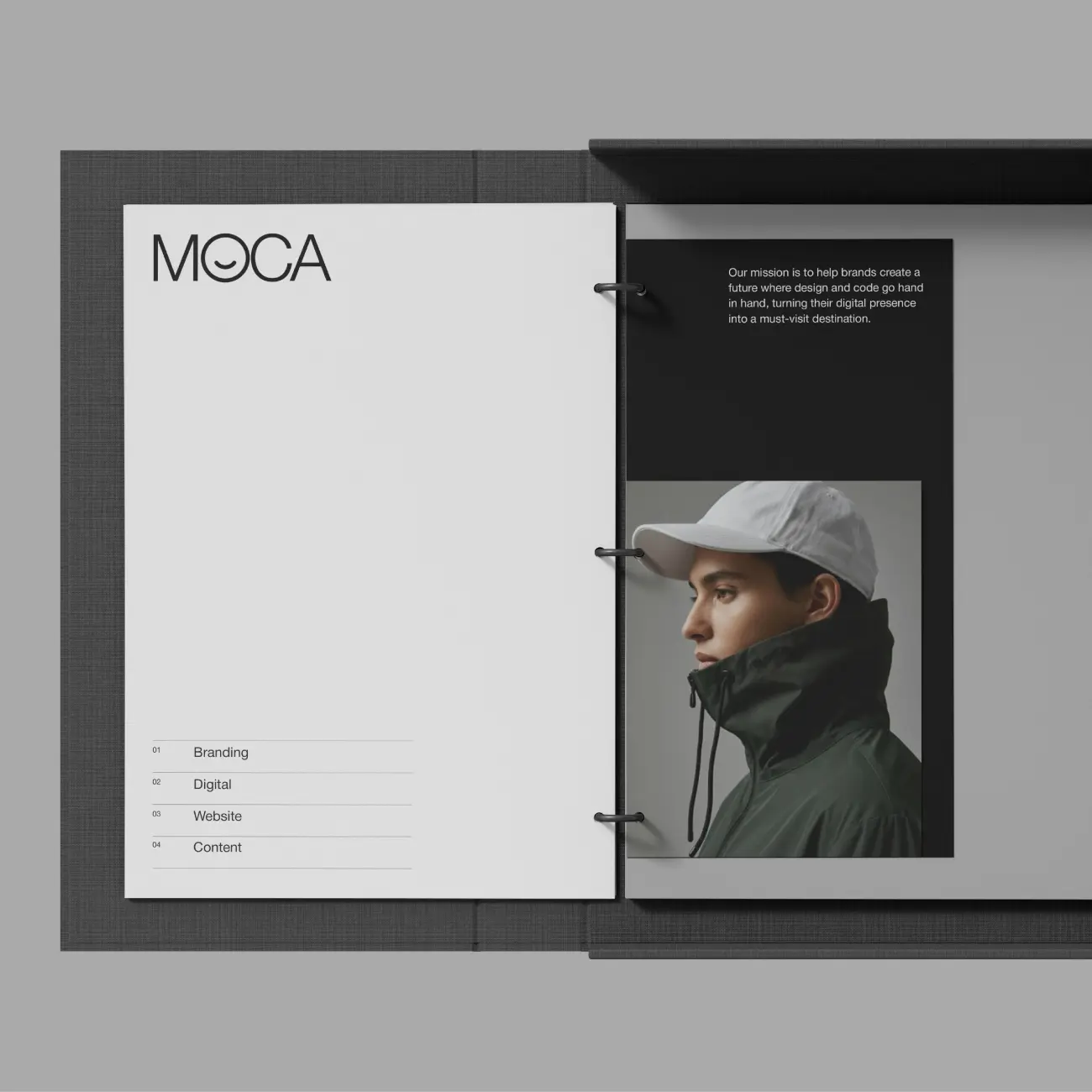
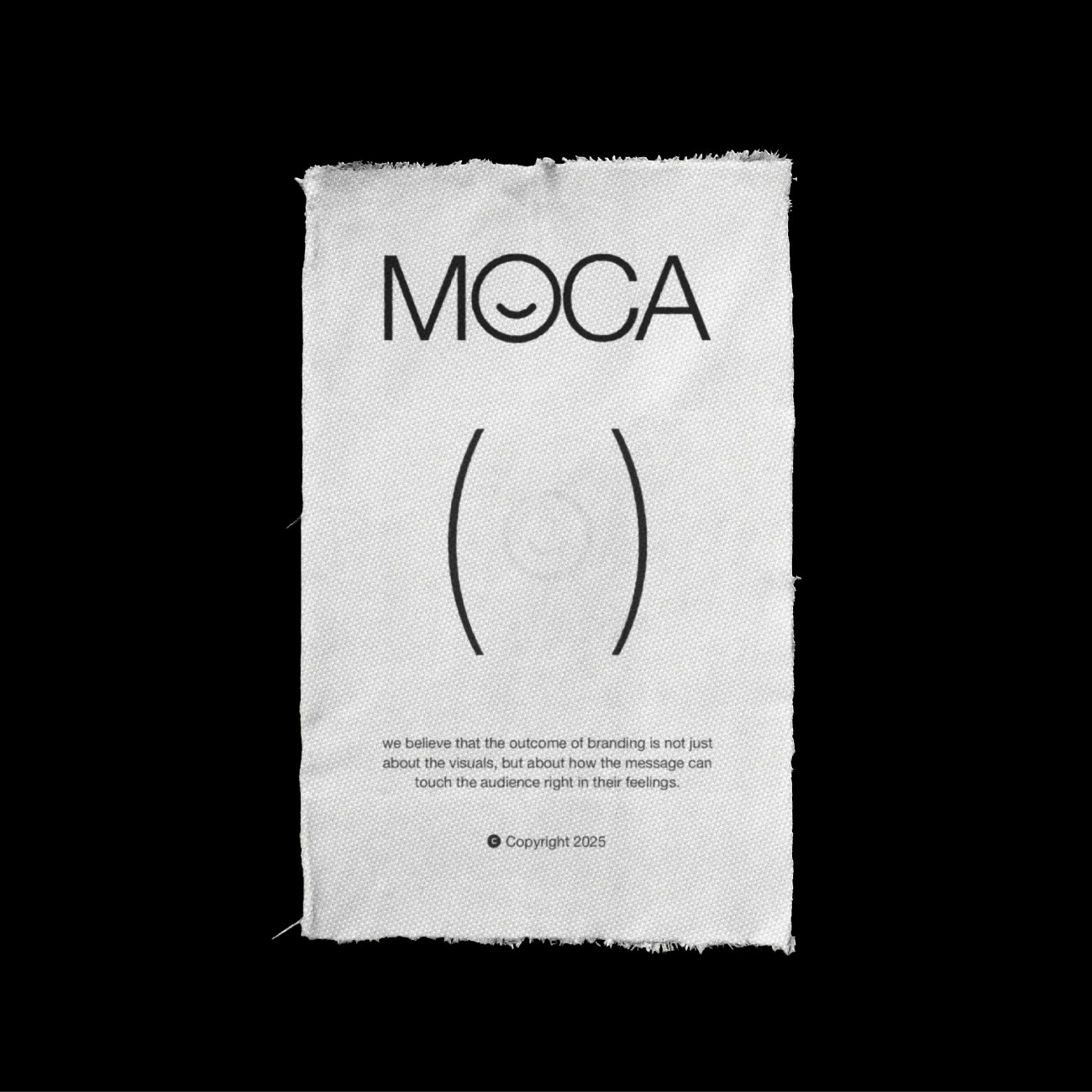
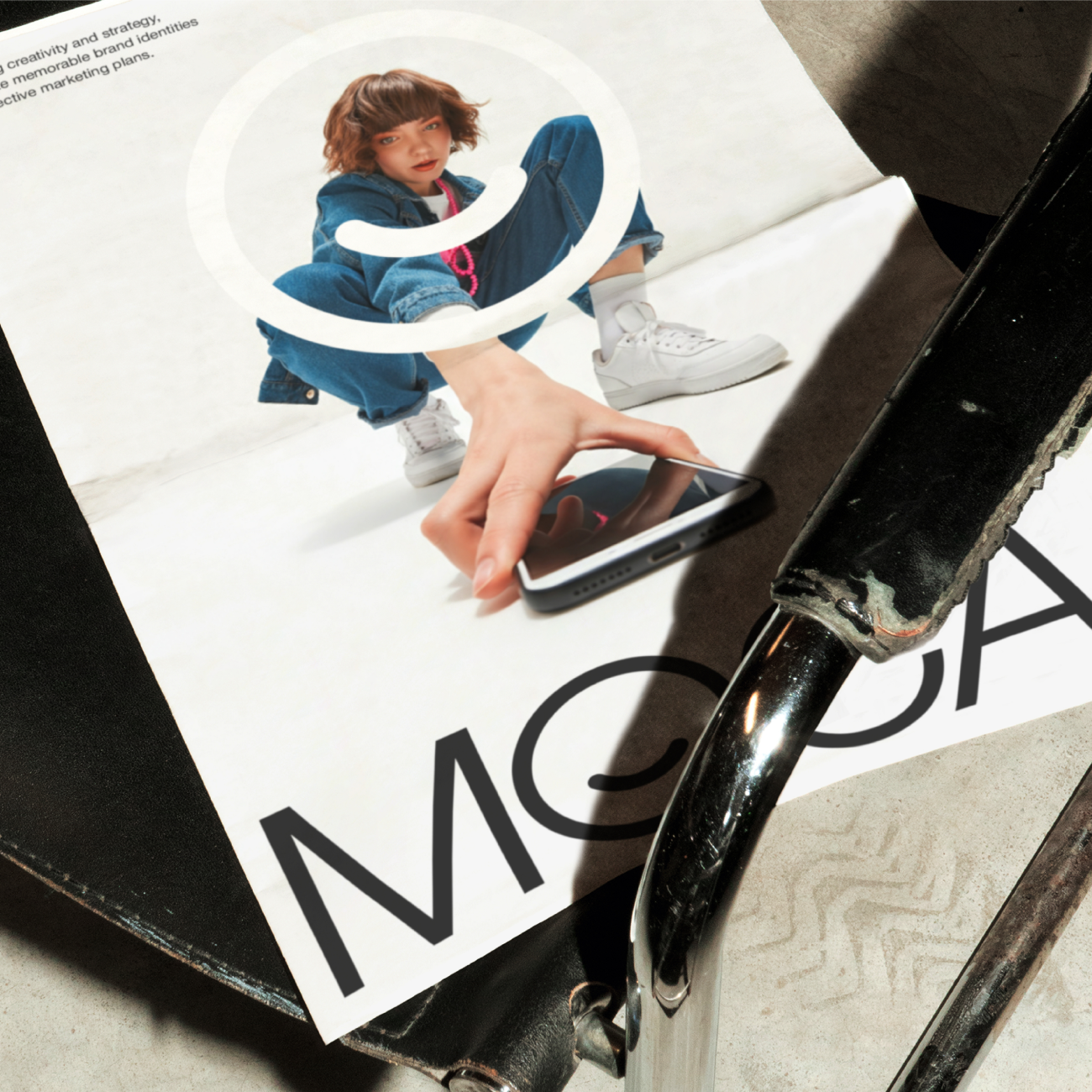
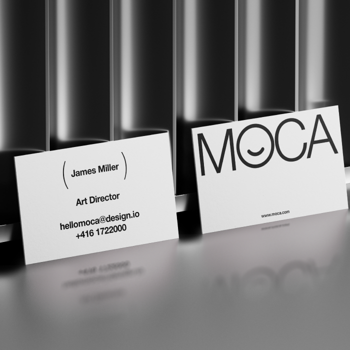
The visual system is built on intentional minimalism: clean geometric typography, a monochrome palette, and precise spatial rhythm. Together, they communicate calm clarity and creative intelligence. The signature detail, a subtly curved “O,” adds warmth to the grid, symbolizing MOCA’s belief that creativity begins with empathy and human connection.
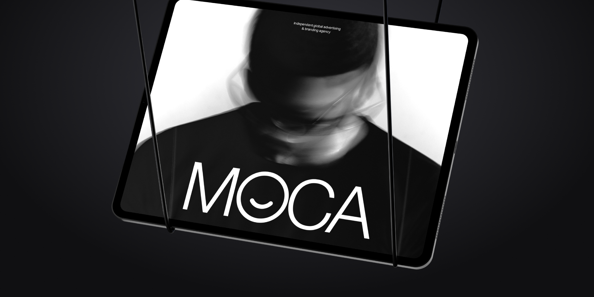
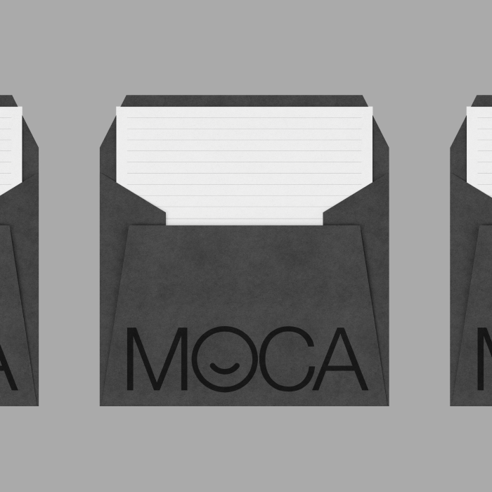
The system scales across digital and physical mediums, including website, stationery, merchandise, and campaign materials. Each layout emphasizes spacious rhythm and visual balance, ensuring that people and ideas remain at the center of every composition.

The goal was to position MOCA as a global creative agency with emotional intelligence and a distinct, understated visual presence.
We aimed to design a modular identity that could flex across print, digital, and environmental touchpoints while maintaining clarity and consistency. Every design decision, from typography to composition, reinforces MOCA’s philosophy of empathy, honesty, and craft.
The final outcome establishes a visual language that feels intelligent yet human, allowing the brand to communicate confidence without spectacle.


In an industry where agencies often overstate their identity, MOCA sought to stand out through quiet design with purpose. The insight was simple, clarity earns more trust than noise.
By embracing modernist principles of structure, restraint, and humanized minimalism, we created a brand that speaks through feeling rather than force. The subtle balance of intellect and warmth became MOCA’s defining character, a design that doesn’t demand attention but naturally commands it.
MOCA proves that emotion, when guided by clarity, is the most enduring form of strategy.